four flavours, four identities
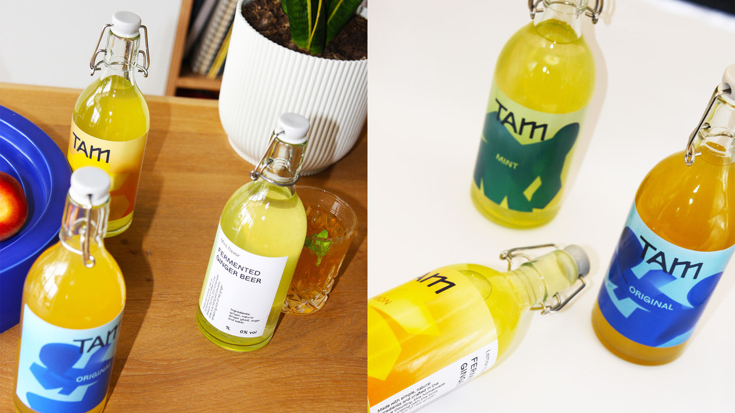
Each of TAM’s four flavours (original, spiced, mint, and lemon) is expressed through its own colour direction: friendly blues for original, fiery reds and oranges for spiced, calm greens for mint, and vibrant yellows for lemon. Together they form a cohesive but varied palette, giving every bottle its own personality while staying recognisably part of the TAM family.
TAM’s branding captures the essence of a drink that refuses to be quiet. It brings the attitude of a microbrewery to an alcohol-free alternative, standing proudly on the shelf with the same energy as its flavour.


heat, movement, and fizz
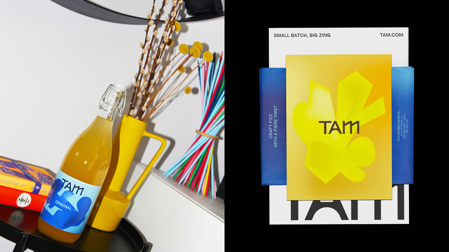
The visual system leans on layered gradients, soft irregular silhouettes, and subtle grain textures that echo the fermentation process and the fizz of ginger beer. Together, these elements create a sense of heat, movement, and unpredictability — alive and full of character, much like the flavour itself. To balance that energy, we anchored the system with clean typographic structures, geometric logo elements, and consistent grid-based layouts.


Our branding for TAM channels the bold, characterful spirit of a microbrewery into an alcohol-free ginger beer. Built around a geometric-yet-organic wordmark and an unapologetically vibrant colour system, the identity captures the duality at the heart of the drink: crafted with care, yet raw and fiery in its expression.
The logo reflects the balance between the industrial precision of small breweries and the irregular, rounded forms of ginger root. This duality gives TAM a wordmark that feels structured yet warm, echoing both the craft of brewing and the energy of something handmade.
TAM
From root to label: packaging identity for TAM
Branding services (logotype, typography, color strategy, iconography, visual elements, imagery, animation style, guidelines), naming, bottle label, packaging material.


