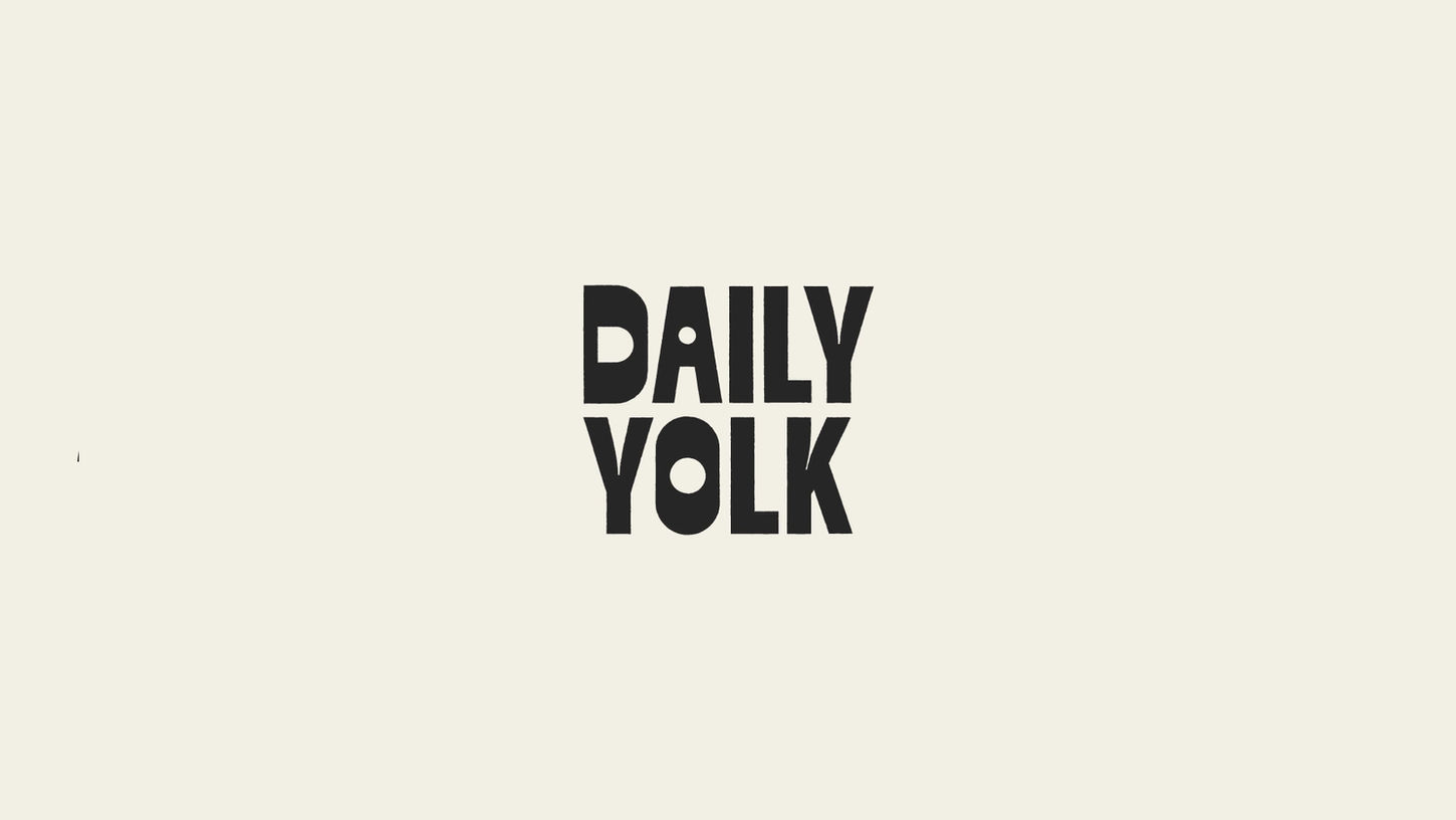
inviting and joyful identity
Daily Yolk’s branding reflects a spot where breakfast always belongs and everyone feels invited. The combination of confident typography, gentle curves, and fun illustrations brings out the joy of brunch, making the experience feel bright, friendly, and full of character — a weekend vibe, even on a Wednesday.


warmth, character, and charm
The visual system leans on soft shapes, hand-drawn illustrations, and a golden palette that conveys warmth and light. Marching eggs, sleepy omelettes, and other playful details give the identity a sense of humor and personality, creating a space that feels both familiar and fresh. Clean typographic hierarchies and consistent layouts ensure the brand feels coherent across menus, packaging, and graphics.


Daily Yolk brings the cozy, playful spirit of the brunch spot we wish existed to life through its visual identity. Built around bold, rounded type and a warm, buttery color palette, the design reflects the welcoming, slow-paced energy of a place made for lingering over pancakes, extra coffee, and sunny mornings (whenever they happen).
Daily Yolk
A cheeky design system for an all-day breakfast club
Branding services (logotype, typography, color strategy, iconography, visual elements, imagery, animation style, guidelines), print material, in-store graphics.


